Contracts Analyzed With Software I Designed
Awards for Product Innovation
Team: Engineers, Legal SMEs, PM Focus: Data Vis, Design Systems
Redefining What Knowable Has to Offer
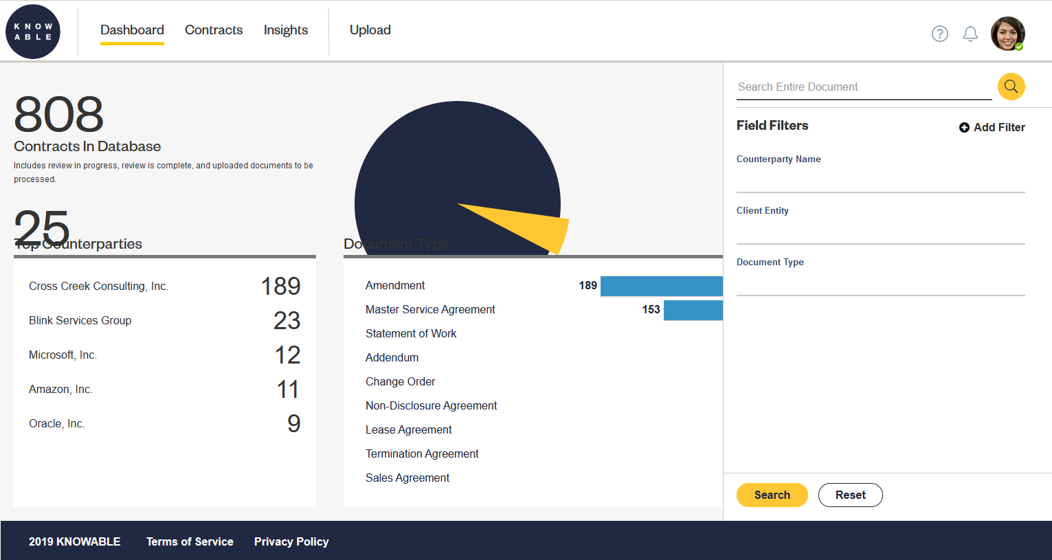
An analytics system gave Knowable a huge pitch over other legal contract management services: Choose Knowable and we’ll give you insights into how your company tends to negotiate its contracts. Before this system existed however, Knowable struggled to stand out and I joined amidst a bad financial year and a significant series of layoffs. Immediately after I was on-boarded and with no prior experience in the legal tech industry I put together an analytics system (supported by a from-scratch design system) that their devs could implement in three months. This system won both of Legalweek’s product innovation awards. It also contributed significantly towards Knowable becoming profitable the following year.
Good Analytics Tools Need Good Design Systems
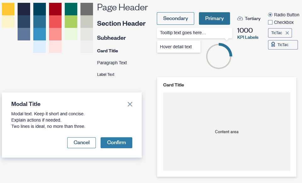
Knowable was a new enough business when I joined that it didn’t have things like colors nailed down yet. To solve this I took inspiration from their logo colors and expanded into a full palette. In the end I had a set of colors that looked great and met accessibility standards in how they were used.
I built out Knowable’s component library at the same time, creating designs for everything from buttons to toggles to spinners. In doing this I was able to see how the colors I was deciding on would show up. I iterated on the colors and components to ensure designs would have good visibility and contrast under the rules of my new system. All the while, I validated my colors, designs, and ideas with engineering, design, and senior leadership to ensure the direction I was taking us met their needs.
Colors and components I created for Knowable’s new design system.
Finding the Most Impactful Chart Designs
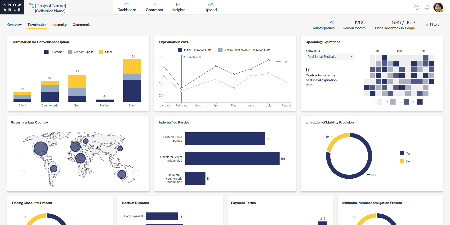
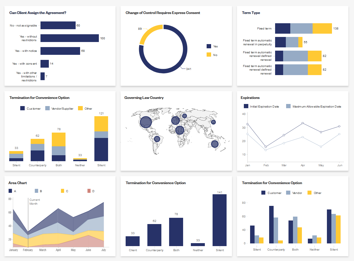
I worked with engineering to find a chart library that worked for us and adapted the charts offered by that library into our look and feel. I determined a set of data colors to use that matched well with the colors I had chosen for the wider design system. I then mocked up a sample of what various analytics charts would look like in the Knowable style. I aimed for an informative yet minimalist approach, leaving room for long legal fields without adding unnecessary UI that would clutter the screen.
The chart designs I created to serve as the backbone for Knowable’s analytics platform.
A Compelling Dashboard MVP
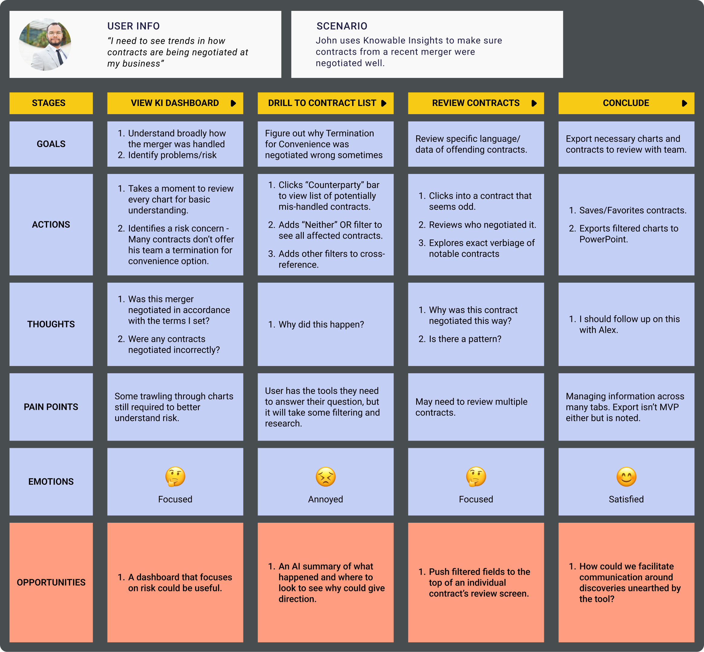
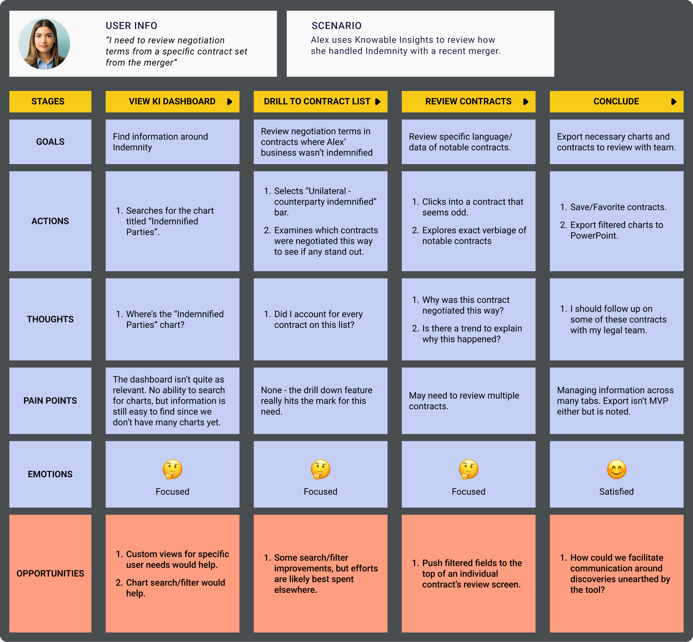
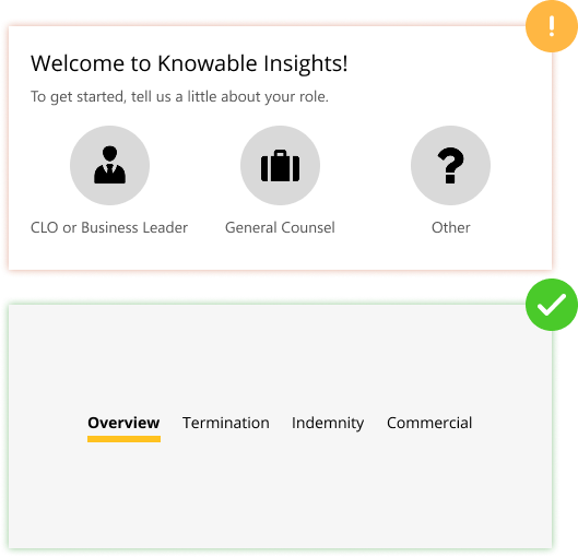
I planned and coordinated a one week design sprint with internal SMEs, my PM, and the head of design in order to get key stakeholders in a room to brainstorm and agree on the overall direction of the analytics system. I was able to come out of the sprint with alignment behind a dashboard style approach to the MVP. Though this would have the tradeoff of filling the screen with charts, it could be implemented in a very small amount of time and improved upon very easily. I can’t share mock-ups of the analytics system beyond this MVP, but following its implementation I led efforts to support view customization and better think through how a user could land into the system and drill down into the data they’re interested in.