Redesigning authentication was a major component of the My Account project. The challenge: authentication setup flows needed to work in two contexts—both as a settings page feature and as interrupting prompts for users who hadn’t met their organization’s security requirements.
I solved this by designing all authentication flows within modal dialogs, allowing them to appear consistently across any screen or context. To prevent overwhelming users with complex security steps in a constrained space, I broke each flow into single-step progressions, guiding users through one action at a time.
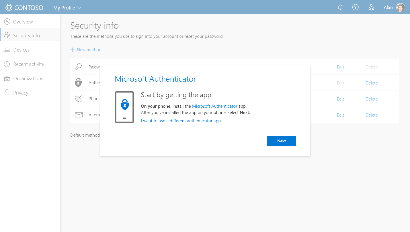
The Microsoft Authenticator setup flow appearing in a dialog box over the Security Info section of My Profile.
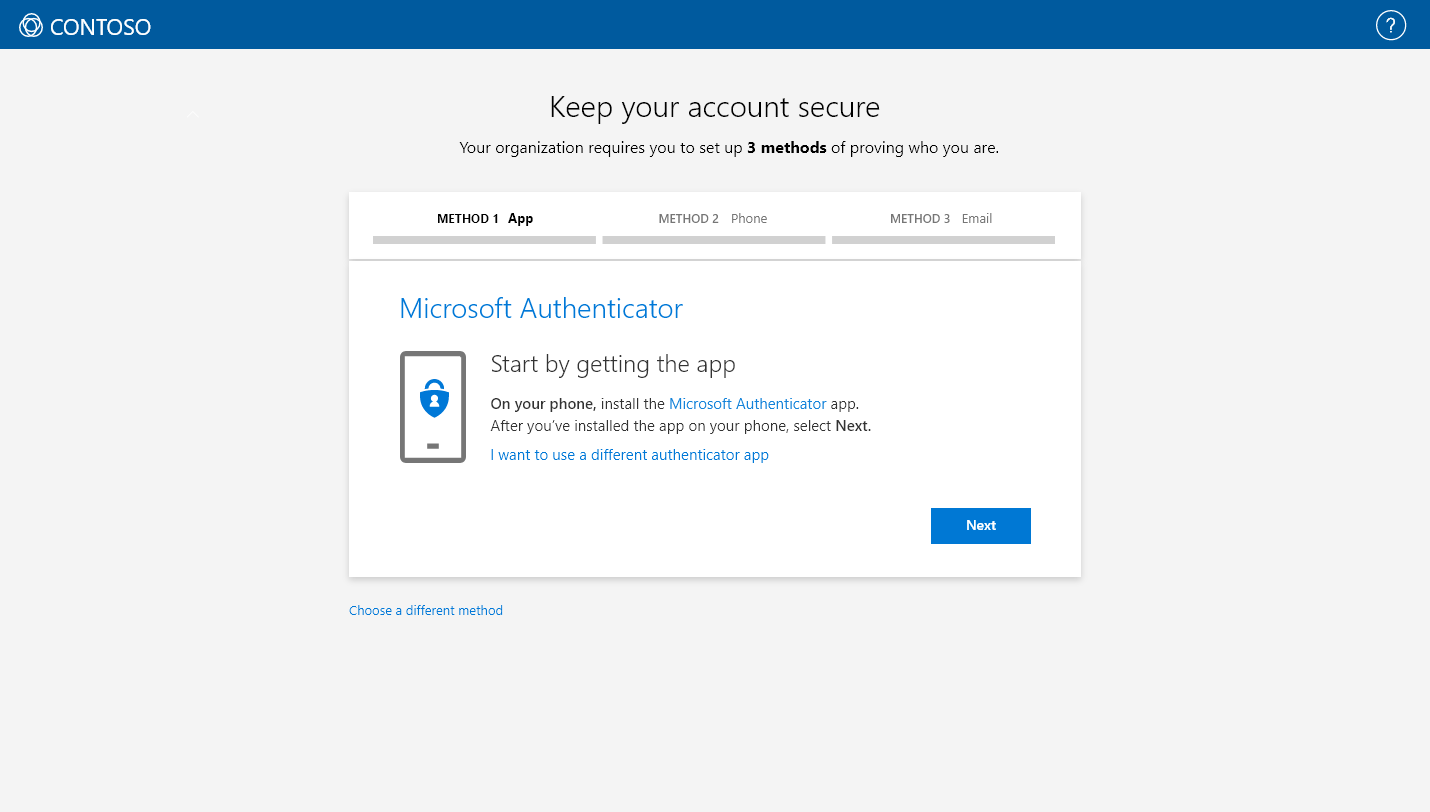
The Microsoft Authenticator setup flow appearing as an interrupt.
I designed setup flows for all of Microsoft’s authentication methods—app-based verification, SMS codes, security keys, and more. The USB security key flow was particularly rewarding: it was featured on the main screen at Microsoft Ignite, showcasing how even technical security features could have an intuitive, approachable interface.
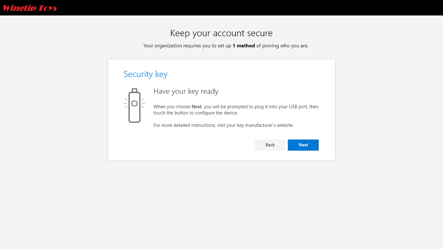
An interrupt where a user has chosen to authenticate using a USB security key.